
19 March 2026
Exchange Traded Funds (ETFs) have become an increasingly popular way for investors to access financial markets. They provide a simple, transparent and relatively low-cost way of gaining exposure to a wide range of assets, from broad equity indices to specific sectors or themes. However, while ETFs make market access straightforward, deciding when to invest or increase exposure can still be challenging. This is where technical analysis can provide a useful perspective.
Technical analysis focuses on price behaviour rather than company accounts or economic forecasts. The basic idea is that market prices reflect the collective actions and emotions of investors. By studying charts, technicians attempt to identify trends and patterns that reveal how buyers and sellers are interacting in the market.
One of the most important concepts in technical analysis is the trend. Markets rarely move in straight lines, but they often move in sustained phases. A rising trend is typically characterised by a sequence of higher highs and higher lows, showing that demand is steadily pushing prices upwards. A falling trend produces the opposite pattern, with lower highs and lower lows as selling pressure dominates. For investors using ETFs to gain exposure to markets, recognising the direction of the prevailing trend can be extremely helpful.
Ichimoku and candlestick analysis
Many technicians use charting tools to help visualise trends more clearly. One example is the Ichimoku Cloud, developed in Japan by journalist Goichi Hosoda during the 1930s and published in the late 1960s after many years of refinement. Its full name, Ichimoku Kinko Hyo, loosely translates as “one glance equilibrium chart”, reflecting the idea that a trader should be able to assess the state of a market quickly.
The cloud itself is formed from two lines derived from recent price ranges and projected ahead of the current price. The shaded area between them acts as a dynamic zone of support or resistance. In simple terms, markets trading above the cloud are generally considered to be in an upward trend, while prices below the cloud suggest a weaker or falling market.
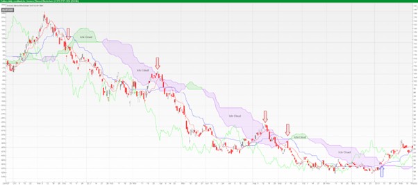
Source AlphaTerminal, 6th March 2026
The chart above illustrates this clearly. The ETF moved decisively below the cloud in December 2021, signalling that the prevailing trend had turned negative. Over the following year, several rallies attempted to push back through the cloud but were repeatedly rejected, notably around April, August and September 2022. In weakening markets, the cloud often acts as a ceiling, and that behaviour is evident here.
Eventually, the situation changed. In January 2023, the ETF finally broke back above the cloud, suggesting that the balance between buyers and sellers was shifting once again. What followed was a strong rally, with the price rising from around $57 to roughly $70 within a matter of weeks.
Many chart analysts use Candlestick Charts, which originated in Japanese rice markets in the 18th century and are widely associated with the trader Munehisa Homma. Each candlestick shows the opening, closing, high and low for a given period, allowing the behaviour of buyers and sellers to be seen more clearly.
Over time, technicians noticed that certain candle shapes appeared repeatedly. These formations were given colourful names such as Hammer, Engulfing Pattern, or Doji, and can sometimes hint at shifts in market momentum. Their meaning depends largely on context, as the same pattern may carry a bullish message in one situation and a bearish one in another.
For that reason, candlestick patterns are rarely used in isolation. Most practitioners combine them with trend analysis, support and resistance levels, or indicators such as the Ichimoku Cloud to build a broader view of market behaviour.
Support and resistance
Technical analysts also pay close attention to support and resistance levels. Support refers to areas where prices have previously found buying interest and stopped falling. Resistance represents levels where rallies have historically stalled as sellers emerge. Markets often react around these areas because participants remember them and adjust their behaviour accordingly.
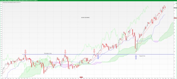
Source AlphaTerminal, 6th March 2026
Click to view larger chart
The chart above provides a good example of this. The horizontal line marks an area that repeatedly acted as resistance earlier in the chart. The first two red arrows highlight occasions between November 2021 and February 2023 where the price rallied up to this level but was unable to push through it.
What makes the chart particularly interesting is what happens later. In February 2024, marked by the first blue arrow, the ETF finally broke decisively above this long-established resistance level. When a market pushes through a level that has capped advances several times, it often signals a shift in the balance between buyers and sellers.
It is also common for old resistance to become new support. The chart demonstrates this clearly. During the volatility triggered by the first round of tariff announcements during the Trump administration, the ETF sold off sharply but found support exactly at the same level that had previously acted as resistance. The market effectively returned to test the breakout point before moving higher again.
Examples like this illustrate why technicians pay close attention to these areas when assessing potential turning points.
For investors using ETFs, chart analysis can provide useful context around market behaviour. Buying near established support or during a strengthening trend may offer a more favourable entry point than purchasing after a sharp rally, while watching how prices behave near resistance can sometimes signal that momentum is fading.
Technical analysis is not a crystal ball, and it does not eliminate investment risk. Markets are influenced by many factors, from economic developments to geopolitical events. What chart analysis can do, however, is highlight trends, shifts in momentum and areas where buying or selling pressure may emerge. By studying price behaviour, investors can form a view on the likely direction of a market and the balance of probabilities.
Used in this way, ETFs and technical analysis can complement each other well. ETFs provide efficient access to markets, while chart analysis helps investors interpret the ever-changing behaviour of those markets.
John Fletcher, FCSI, MSTA
Investment Manager
John Fletcher is a former floor trader, Fellow of the Chartered Institute for Securities & Investment and a qualified technical analyst, having achieved MSTA status in 2008. If you would like to discuss this article further, please contact him directly at [email protected].

Important Note
No news or research content is a recommendation to deal. It is important to remember that the value of investments and the income from them can go down as well as up, so you could get back less than you invest. If you have any doubts about the suitability of any investment for your circumstances, you should contact your financial advisor.

The value of investments can fall as well as rise. Investors may get back less than invested. Past performance is not a reliable indicator of future results.
The value of investments can fall as well as rise. Investors may get back less than invested.


